
Introduction
Over the last few years, advanced machine learning algorithms have been widely utilized in different contexts of education. The literature shows that educational researchers typically perform machine learning models for classification (or prediction) problems, such as student engagement (e.g., Hew et al., 2018), performance (e.g., Xu et al., 2017), and dropout (e.g., Tan & Shao, 2015). Researchers often try different classification algorithms and select the most accurate model based on model evaluation metrics (e.g., recall, precision, accuracy, and area under the curve). However, the comparison and evaluation of machine learning models based on these evaluation metrics are not necessarily easy to use for most researchers.
In this post, we demonstrate a versatile R package that can be used to visualize and interpret machine learning models: DALEX (Biecek, 2018). DALEX package stands for moDel Agnostic Language for Exploration and eXplanation. It can be used for both regression and classification tasks in machine learning. With the DALEX package, we can examine residual diagnostics, feature importance, the relationship between features and the outcome variable, the accuracy of future predictions, and many other things. Using real data from a large-scale assessment, we will review some of the data visualization tools available in DALEX.
Now, let’s get started 📈.
Example
In this example, we will use student data from the OECD’s Programme for International Student Assessment (PISA). PISA is an international. large-scale assessment that measures 15-year-old students’ competency in reading, mathematics and science. Using the Turkish sample of the PISA 2015 database, we will build a binary classification model that predicts students’ reading performance (i.e., high vs. low performance) and then use the DALEX package to evaluate and compare different machine learning algorithms. The data set is available here. The variables in the data set are shown below:
| Variable | Description |
|---|---|
| gender | Gender |
| grade | Grade |
| computer | Having a vomputer at home |
| internet | Having Internet at home |
| desk | Having a study desk at home? |
| own.room | Owning a room at home |
| quiet.study | Owning a quiet study area at home |
| book.sch | Having school books |
| tech.book | Having technical books |
| art.book | Having art books |
| reading | Students’ reading scores in PISA 2015 |
First, we will import the data into R and preview its content:
Second, we will remove missing cases from the data.
pisa <- na.omit(pisa)
Next, we will convert gender and grade to numeric variables. Also, in the DALEX package, the outcome variable needs to be a numeric vector for both regression and classification tasks. Thus, we will transform students’ reading scores into a binary variable based on the average reading score: 1 (i.e., high performance) vs. 0 (i.e., low performance).
# Convert gender to a numeric variable
pisa$gender = (as.numeric(sapply(pisa$gender, function(x) {
  if(x=="Female") "1"
  else if (x=="Male") "0"})))

# Convert grade to a numeric variable
pisa$grade = (as.numeric(sapply(pisa$grade, function(x) {
  if(x=="Grade 7") "7"
  else if (x=="Grade 8") "8"
  else if (x=="Grade 9") "9"
  else if (x=="Grade 10") "10"
  else if (x=="Grade 11") "11"
  else if (x=="Grade 12") "12"})))

# Convert reading performance to a binary variable based on the average score
# 1 represents high performance and 0 represents low performance
pisa$reading <- factor(ifelse(pisa$reading >= mean(pisa$reading), 1, 0))

# View the frequencies for high and low performance groups
table(pisa$reading)
   0    1
2775 2722
Now, we will build a machine learning model using three different algorithms: random forest, logistic regression, and support vector machines. Since the focus of our post is on how to visualize machine learning models, we will build the machine learning models without additional hyperparameter tuning. We use the createDataPartition() function from the caret package (Kuhn, 2020) to create training (70%) and testing (30%) sets.
# Activate the caret package
library("caret")

# Set the seed to ensure reproducibility
set.seed(1)

# Split the data into training and testing sets
index <- createDataPartition(pisa$reading, p = 0.7, list = FALSE)
train <- pisa[index, ]
test  <- pisa[-index, ]
Next, we use the train() function from the caret package to create three classification models through 5-fold cross-validation. In each model, reading ~ . indicates that the outcome variable is reading (1 = high performance, 0 = low performance) and the remaining variables are the predictors.
# 5-fold cross-validation
control = trainControl(method="repeatedcv", number = 5, savePredictions=TRUE)

# Random Forest
mod_rf = train(reading ~ .,
               data = train, method='rf', trControl = control)

# Generalized linear model (i.e., Logistic Regression)
mod_glm = train(reading ~ .,
                data = train, method="glm", family = "binomial", trControl = control)

# Support Vector Machines
mod_svm <- train(reading ~.,
                 data = train, method = "svmRadial", prob.model = TRUE, trControl=control)
Now, we are ready to explore the DALEX package. The first step of using the DALEX package is to define explainers for machine learning models. For this, we write a custom predict function with two arguments: model and newdata. This function returns a vector of predicted probabilities for each class of the binary outcome variable.
In the second step, we create an explainer for each machine learning model using the explainer() function from the DALEX package, the testing data set, and the predict function. When we convert machine learning models to an explainer object, they contain a list of the training and metadata on the machine learning model.
# Activate the DALEX package
library("DALEX")

# Create a custom predict function
p_fun <- function(object, newdata){
  predict(object, newdata=newdata, type="prob")[,2]
  }

# Convert the outcome variable to a numeric binary vector
yTest <- as.numeric(as.character(test$reading))

# Create explainer objects for each machine learning model
explainer_rf  <- explain(mod_rf, label = "RF",
                         data = test, y = yTest,
                         predict_function = p_fun,
                         verbose = FALSE)

explainer_glm <- explain(mod_glm, label = "GLM",
                         data = test, y = yTest,
                         predict_function = p_fun,
                         verbose = FALSE)

explainer_svm <- explain(mod_svm, label = "SVM",
                         data = test, y = yTest,
                         predict_function = p_fun,
                         verbose = FALSE)
Model Performance
With the DALEX package, we can analyze model performance based on the distribution of residuals. Here, we consider the differences between observed and predicted probabilities as residuals. The model_performance() function calculates predictions and residuals for the testing data set.
# Calculate model performance and residuals
mp_rf  <- model_performance(explainer_rf)
mp_glm <- model_performance(explainer_glm)
mp_svm <- model_performance(explainer_svm)

# Random Forest
mp_rf
Measures for:  classification
recall     : 0.663
precision  : 0.6558
f1         : 0.6594
accuracy   : 0.6608
auc        : 0.7165

Residuals:
     0%     10%     20%     30%     40%     50%     60%     70%
-1.0000 -0.9646 -0.3952 -0.2440 -0.0580  0.0000  0.0020  0.0160
    80%     90%    100%
 0.2340  0.6840  1.0000
# Logistic Regression
mp_glm
Measures for:  classification
recall     : 0.6924
precision  : 0.6479
f1         : 0.6694
accuracy   : 0.6614
auc        : 0.7165

Residuals:
      0%      10%      20%      30%      40%      50%      60%
-0.94870 -0.63986 -0.48616 -0.38661 -0.20636 -0.04374  0.28757
     70%      80%      90%     100%
 0.35729  0.41568  0.58303  0.98097
# Support Vector Machines
mp_svm
Measures for:  classification
recall     : 0.6556
precision  : 0.6613
f1         : 0.6585
accuracy   : 0.6632
auc        : 0.7025

Residuals:
     0%     10%     20%     30%     40%     50%     60%     70%
-0.7026 -0.6870 -0.3824 -0.2882 -0.2835 -0.1896  0.3129  0.3129
    80%     90%    100%
 0.3346  0.6912  0.8474
Based on the performance measures of these three models (i.e., recall, precision, f1, accuracy, and AUC) from the above output, we can say that the models seem to perform very similarly. However, when we check the residual plots, we see how similar or different they are in terms of the residuals. Residual plots show the cumulative distribution function for absolute values from residuals and they can be generated for one or more models. Here, we use the plot() function to generate a single plot that summarizes all three models. This plot allows us to make an easy comparison of absolute residual values across models.
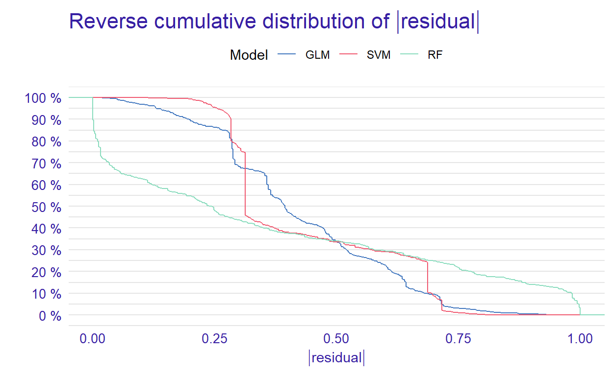
Figure 1: Plot of reserve cumulative distribution of residuals
From the reverse cumulative of the absolute residual plot, we can see that there is a higher number of residuals in the left tail of the SVM residual distribution. It shows a higher number of large residuals compared to the other two models. However, RF has a higher number of large residuals than the other models in the right tail of the residual distribution.
In addition to the cumulative distributions of absolute residuals, we can also compare the distribution of residuals with boxplots by using geom = “boxplot” inside the plot function.
p2 <- plot(mp_rf, mp_glm, mp_svm, geom = "boxplot")
p2
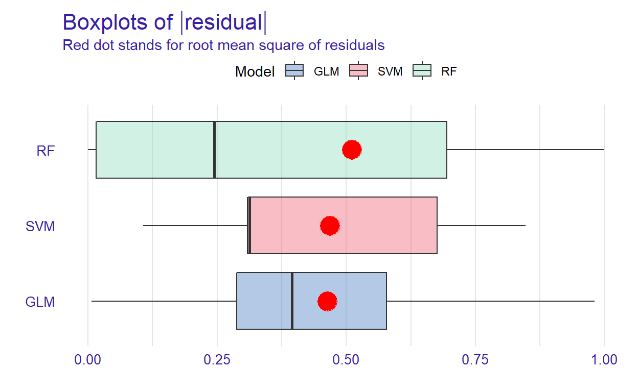
Figure 2: Boxplots of residuals
Figure 2 shows that RF has the lowest median absolute residual value. Although the GLM model has the highest AUC score, the RF model performs best when considering the median absolute residuals. We can also plot the distribution of residuals with histograms by using geom=“histogram” and the precision recall curve by using geom=“prc.”
# Activate the patchwork package to combine plots
library("patchwork")

p1 <- plot(mp_rf, mp_glm, mp_svm, geom = "histogram")
p2 <- plot(mp_rf, mp_glm, mp_svm, geom = "prc")
p1 + p2
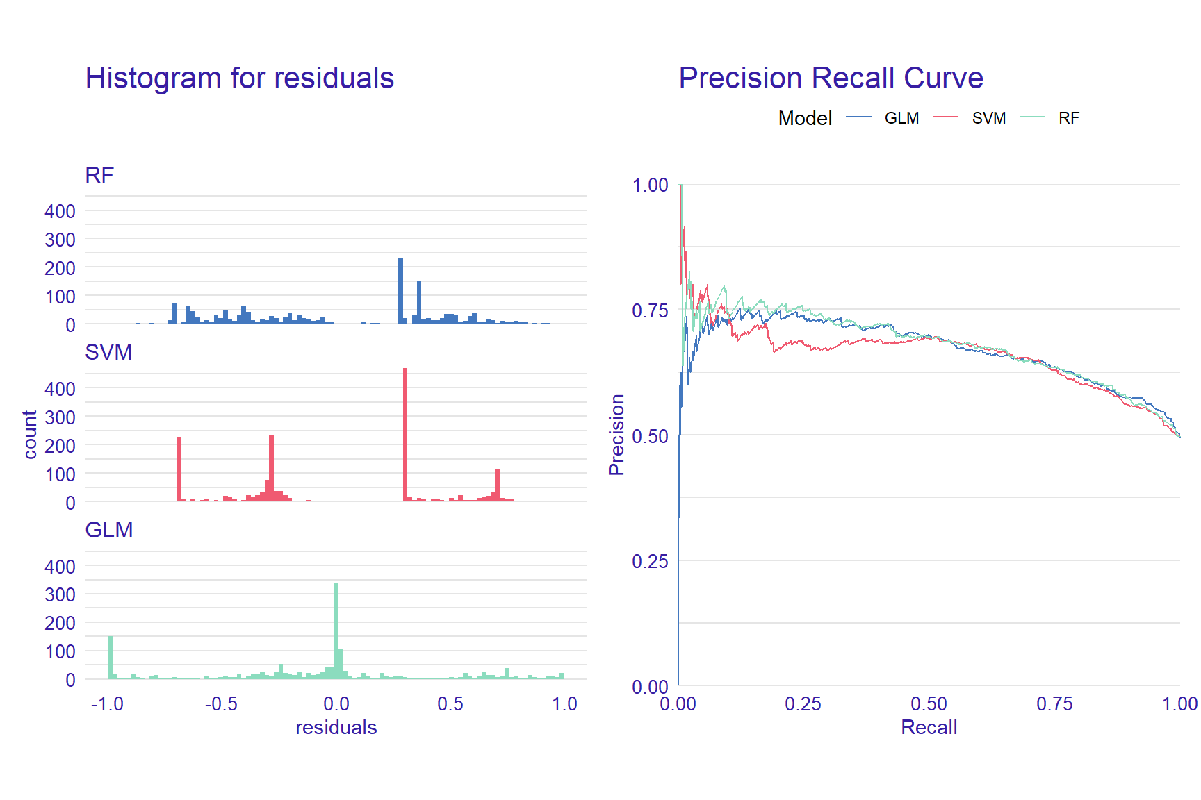
Figure 3: Histograms for residuals and precision-recall curve
Variable Importance
When using machine learning models, it is important to understand which predictors are more influential on the outcome variable. Using the DALEX package, we can see which variables are more influential on the predicted outcome. The variable_importance() function computes variable importance values through permutation, which then can be visually examined using the plot function.
vi_rf <- variable_importance(explainer_rf, loss_function = loss_root_mean_square)
vi_glm <- variable_importance(explainer_glm, loss_function = loss_root_mean_square)
vi_svm <- variable_importance(explainer_svm, loss_function = loss_root_mean_square)

plot(vi_rf, vi_glm, vi_svm)
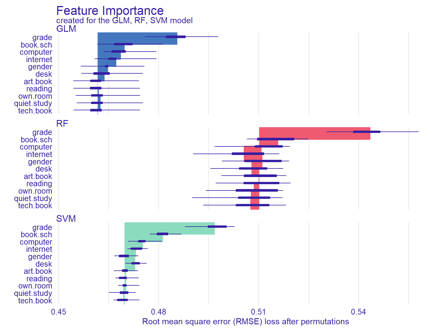
Figure 4: Feature importance plots
In Figure 4, the width of the interval bands (i.e., lines) corresponds to variable importance, while the bars indicate RMSE loss after permutations. Overall, the GLM model seems to have the lowest RMSE, whereas the RF model has the highest RMSE. The results also show that if we list the first two most influential variables on the outcome variable, grade and having school books seem to influence all three models significantly.
Another function that calculates the importance of variables using permutations is model_parts(). We will use the default loss_fuction - One minus AUC - and set show_boxplots = FALSE this time. Also, we limit the number of variables on the plot with max_vars to show make the plots more readable if there is a large number of predictors in the model.
vip_rf  <- model_parts(explainer = explainer_rf,  B = 50, N = NULL)
vip_glm  <- model_parts(explainer = explainer_glm,  B = 50, N = NULL)
vip_svm <- model_parts(explainer = explainer_svm, B = 50, N = NULL)

plot(vip_rf, vip_glm, vip_svm, max_vars = 4, show_boxplots = FALSE) +
  ggtitle("Mean variable-importance over 50 permutations", "")
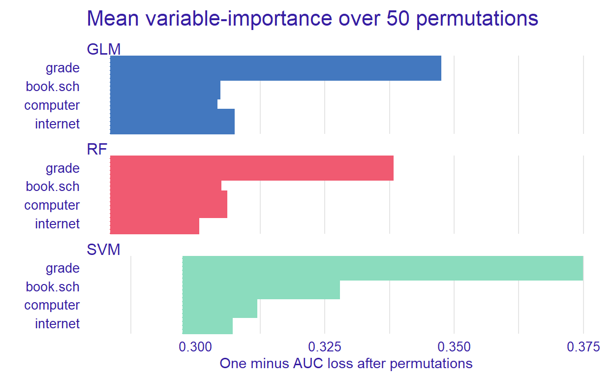
Figure 5: Mean variable importance for some predictors
After identifying the influential variables, we can show how the machine learning models perform based on different combinations of the predictors.
Partial Dependence Plot
With the DALEX package, we can also create explainers that show the relationship between a predictor and model output through Partial Dependence Plots (PDP) and Accumulated Local Effects (ALE). These plots show whether or not the relationship between the outcome variable and a predictor is linear and how each predictor affects the prediction process. Therefore, these plots can be created for one predictor at a time. The model_profile() function with the parameter type = “partial” calculates PDP. We will use the grade variable to create a partial dependence plot.
pdp_rf <- model_profile(explainer_rf, variable = "grade", type = "partial")
pdp_glm <- model_profile(explainer_glm, variable = "grade", type = "partial")
pdp_svm <- model_profile(explainer_svm, variable = "grade", type = "partial")

plot(pdp_rf, pdp_glm, pdp_svm)
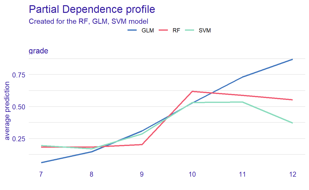
Figure 6: Partial dependence of grade in the models
Figure 6 can helps us understand how grade affects the classification of reading performance. The plot shows that the probability (see the y-axis) is low until grade 9 (see the x-axis) but then increases for all of the models. However, it decreases after grade 10 for the RF and SVM models.
Accumulated Local Effects Plot
ALE plots are the extension of PDP, which is more suited for correlated variables. The model_profile() function with the parameter type = “accumulated” calculates the ALE curve. Compared with PDP plots, ALE plots are more useful because predictors in machine learning models are often correlated to some extent, and ALE plots take the correlations into account.
ale_rf  <- model_profile(explainer_rf, variable = "grade", type = "accumulated")
ale_glm  <- model_profile(explainer_glm, variable = "grade", type = "accumulated")
ale_svm  <- model_profile(explainer_svm, variable = "grade", type = "accumulated")

plot(ale_rf, ale_glm, ale_svm)
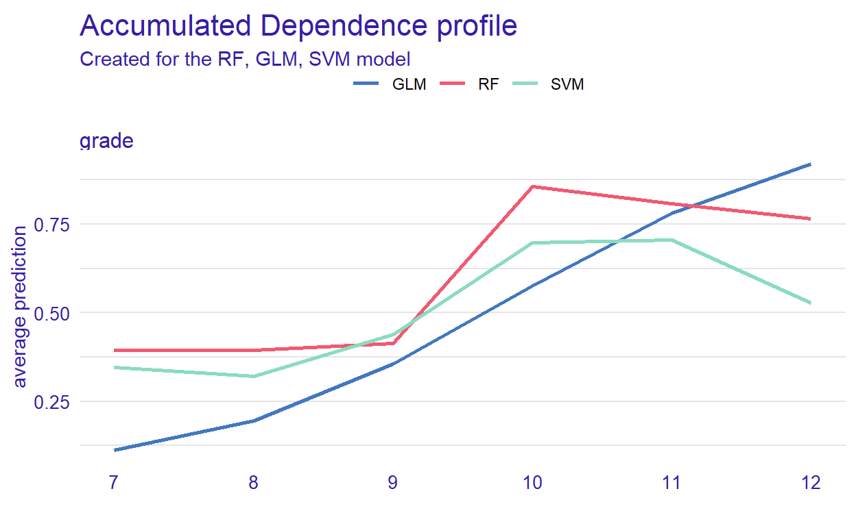
Figure 7: Accumulated local effect of grade in the models
Instance Level Explanation
Using DALEX, we can also see how the models behave for a single observation. We can select a particular observation from the data set or define a new observation. We investigate this using the predict_parts() function. This function is a special case of the model_parts(). It calculates the importance of the variables for a single observation while model_parts() calculates it for all observations in the data set.
We show this single observation level explanation by using the RF model. We could also create the plots for each model and compare the importance of a selected variable across the models. We will use an existing observation (i.e., student 1) from the testing data set.
student1 <- test[1, 1:11]
pp_rf <- predict_parts(explainer_rf, new_observation = student1)

plot(pp_rf)
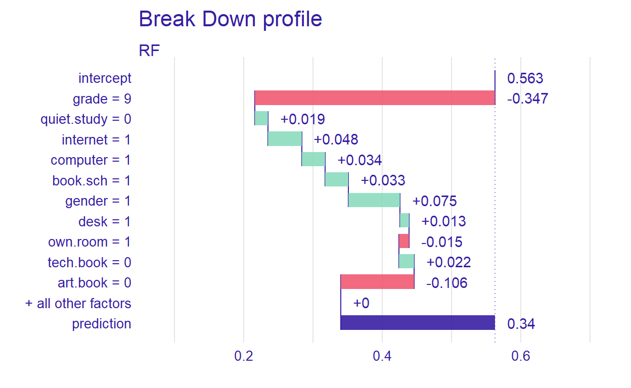
Figure 8: Prediction results for student 1
Figure 8 shows that the prediction probability for the selected observation is 0.34. Also, grade seems to be the most important predictor. Next, we will define a hypothetical student and investigate how the RF model behaves for this student.
new_student <- data.frame(gender = 0,
                          grade = 10,
                          computer = 0,
                          internet = 0,
                          desk=1,
                          own.room=1,
                          quiet.study=1,
                          book.sch = 1,
                          tech.book=1,
                          art.book=1)

pp_rf_new <- predict_parts(explainer_rf, new_observation = new_student)
plot(pp_rf_new)
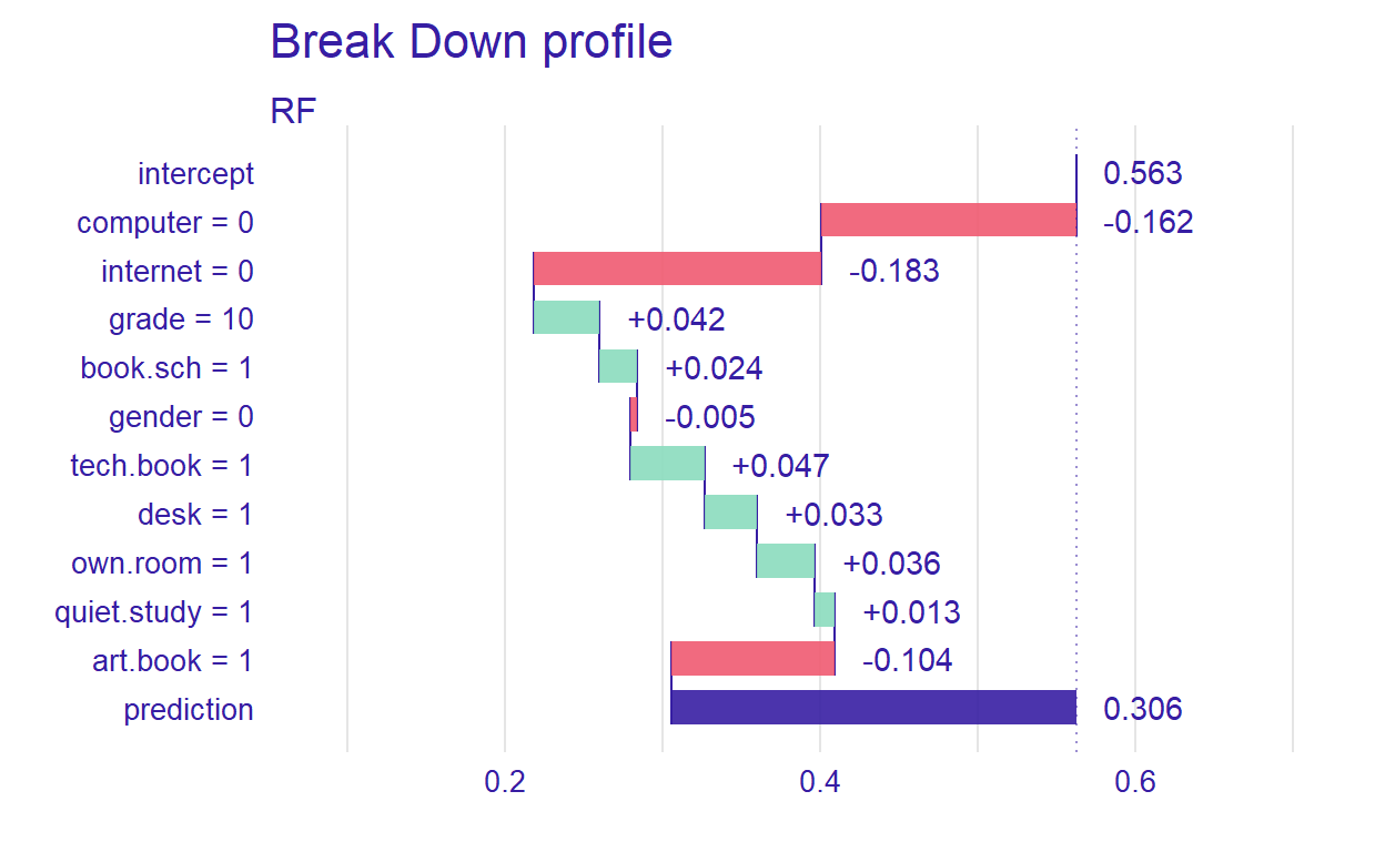
Figure 9: Prediction results for a hypothetical student
For the new student we have defined, the most important variable that affects the prediction is computer. Setting type=“shap,” we can inspect the contribution of the predictors for a single observation.
pp_rf_shap <- predict_parts(explainer_rf, new_observation = new_student, type = "shap")
plot(pp_rf_shap)
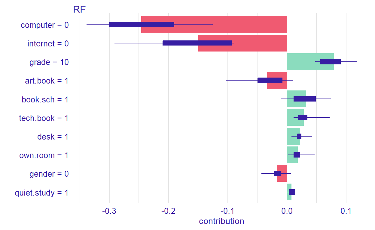
Figure 10: Contributions of the predictors to the prediction process
Ceteris Paribus Profiles
In the previous section, we have discussed the PDP plots. Ceteris Paribus Profiles (CPP) is the single observation level version of the PDP plots. To create this plot, we can use predict_profile() function in the DALEX package. In the following example, we select two predictors for the same observation (i.e., student 1) and create a CPP plot for the RF model. In the plot, blue dots represent the original values for the selected observation.
selected_variables <- c("grade", "gender")
cpp_rf <- predict_profile(explainer_rf, student1, variables = selected_variables)

plot(cpp_rf, variables = selected_variables)
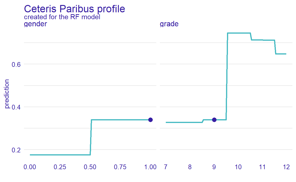
Figure 11: CPP plot for student 1
Conclusion
In this post, we wanted to demonstrate how to use data visualizations to evaluate the performance machine learning models beyond the conventional performance measures. Data visualization tools in the DALEX package enable residual diagnostics of the machine learning models, a comparison of variable importance, and a comprehensive evaluation of the relationship between each predictor and the outcome variable. Also, the package offers tools for visualizing the machine learning models based on a particular observation (either real or hypothetical). We hope that these features of the DALEX package will help you in the comparison and interpretation of machine learning models. More examples of DALEX are available on the DALEX authors’ book (Biecek & Burzykowski, 2021), which is available online at http://ema.drwhy.ai/.