
Introduction
As a visual learner, I often use data visualization to present the results of surveys and other types of self-report measures (e.g., psychological scales). In the 2019 annual meeting of the Canadian Society for the Study of Education (CSSE), I gave a half-day workshop on how to visualize assessment and survey results effectively (the workshop slides are available on my GitHub page)1. My goal was to demonstrate readily-available tools that can be used for creating effective visualizations with survey and assessment data. Since my CSSE workshop in 2019, I have come across several other tools that can be quite useful for presenting survey results visually. So, I decided to share them in a blog post.
There are several ways to visualize data, depending on the type of variables as well as the message to be conveyed to the audience. Figure 1 presents some guidelines regarding which type of visualization to choose depending on the purpose of visualization, the type of variables, and the number of variables. Similar guidelines for data visualization are available on the Venngage website. Also, I definitely recommend you to check out Darkhorse Analytics’ blog post “Data Looks Better Naked.” The authors demonstrate how to create effective visualizations by eliminating redundancy in figures and charts.
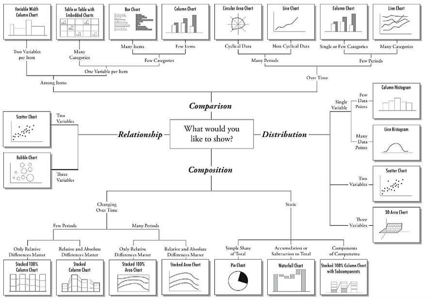
Figure 1: Types of data visualization (Source: https://extremepresentation.com/)
In this post, I will use real data from a questionnaire included in OECD’s Programme for International Student Assessment (PISA). PISA is an international, large-scale assessment administered to 15-year-old students across many countries and economies around the world. In 2015, nearly 540,000 students from 72 countries participated in PISA. After finishing reading, math, and science assessments, students also complete a questionnaire with several items focusing on their learning in school, their attitudes towards different aspects of learning, and non-cognitive/metacognitive constructs. Using students’ responses in the questionnaire, I will demonstrate five alternative tools to visualize survey data.
Let’s get started 📈.
Example
In this example, we will use a subset of the PISA 2015 dataset that includes students’ responses to some survey items and some demographic variables (e.g., age, gender, and immigration status). The sample only consists of students who participated in PISA 2015 from Alberta, Canada (\(n = 2,133\)). The data set is available in a .csv format here.
There are 10 Likert-type survey items potentially measuring students’ attitudes towards teamwork. The first eight items share the same question statement: “To what extent do you disagree or agree about yourself?” while the last two items are independent. Now let’s see all of the items included in the data.
| Question ID | Question Statement |
|---|---|
| ST082Q01 | I prefer working as part of a team to working alone. |
| ST082Q02 | I am a good listener. |
| ST082Q03 | I enjoy seeing my classmates be successful. |
| ST082Q08 | I take into account what others are interested in. |
| ST082Q09 | I find that teams make better decisions than individuals. |
| ST082Q12 | I enjoy considering different perspectives. |
| ST082Q13 | I find that teamwork raises my own efficiency. |
| ST082Q14 | I enjoy cooperating with peers. |
| ST034Q02 | I make friends easily at school. |
| ST034Q05 | Other students seem to like me. |
Students can answer the items by selecting one of the following response options or skip them without choosing a response option (missing responses are labeled as 999 in the data):
- 1 = Strongly disagree
- 2 = Disagree
- 3 = Agree
- 4 = Strongly agree
We will begin the analysis by reading the data in R and previewing the first few rows.
In the following sections, I will demonstrate how to visualize the items in the PISA data set. The visualizations focus on either individual items or the relationship among the items.
Correlation Matrix Plot
We will begin the visualization process by creating a correlation matrix plot. This plot takes the correlation matrix of a group of items as an input and transforms it into a colored table similar to a heatmap. Negative and positive correlations are represented by different colors. Also, the darkness (or lightness) of the colors indicates the strength of pairwise correlations. Using this plot, we can:
- understand the direction and strength of the relationships among the items,
- detect problematic items (i.e., items that are weakly correlated with the rest of the items), and
- identify the items that may require reverse-coding due to inconsistent phrasing (e.g., negative phrasing in some items).
To create a correlation matrix plot, we can use either corrplot (Wei & Simko, 2017) or ggcorrplot (Kassambara, 2019). First, we will select the survey items (those starting with ST082 and ST034 in the data). Next, we will save pairwise correlations among the items (i.e., a 10x10 matrix of correlations). Finally, we will create a correlation matrix plot using the two packages above. For preparing the data for data visualizations, we will use the dplyr package (Wickham et al., 2020).
Now, let’s create our correlation matrix plot using corrplot. In the corrplot function, order = "hclust" applies hierarchical clustering to group the items together based on their correlations with each other. The other option, addrect = 2, refers to the number of rectangles that we want to draw around the item clusters. In our example, we suspect that there may be two clusters of items: one for the first 8 items (focusing on teamwork) and another for the last 2 items (focusing on being liked by friends). Item clusters in Figure 2 seem to confirm our suspicion.
# Activate the corrplot package
library("corrplot")

# Correlation matrix plot
corrplot(cormat, # correlation matrix
         order = "hclust", # hierarchical clustering of correlations
         addrect = 2) # number of rectangles to draw around clusters
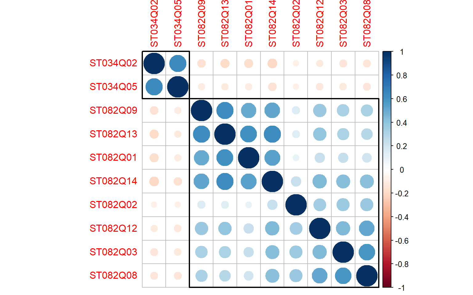
Figure 2: Correlation matrix plot of the PISA survey items (using corrplot)
We will also use ggcorrplot to create a correlation matrix plot. The procedure is very similar. By using type = "lower", we will only visualize the lower diagonal part of the correlation matrix.
# Activate the ggcorrplot package
library("ggcorrplot")

# Correlation matrix plot
ggcorrplot(cormat, # correlation matrix
           type = "lower", # print the lower part of the correlation matrix
           hc.order = TRUE, # hierarchical clustering of correlations
           lab = TRUE) # add correlation values as labels
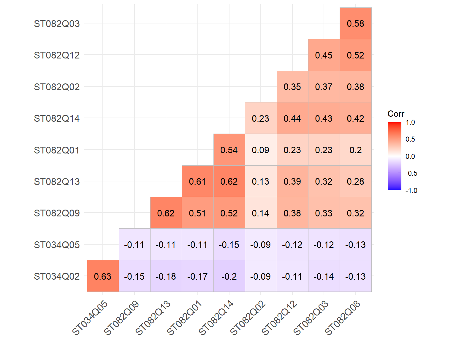
Figure 3: Correlation matrix plot of the PISA survey items (using ggcorrplot)
Both correlation matrix plots confirm our initial suspicion that the last two items (i.e., ST034Q02 and ST034Q05) are correlated with each other, but not with the rest of the survey items. If we are building a scale focusing on “teamwork,” we can probably exclude these two items since they would not contribute to the scale sufficiently.
UpSet Plot
The next visualization tool that we will try is called “UpSet plot.” UpSet plots can show the intersections of multiple sets of data. These plots allow users to visualize a complex set of relationships among variables from different data sets. This visualization method enables users to combine different plots (e.g., Venn diagrams, bar charts, etc.) based on the intersections in the data. You can watch this nice video to better understand the design and use of UpSet plots2. In R, the UpSetR package (Gehlenborg, 2019) can be used to generate UpSet plots easily. The authors of the package also have a Shiny app and a web version (https://vcg.github.io/upset/) that help users generate UpSet plots without any coding in R.
In our example, we will use the naniar package (Tierney et al., 2020) to create an UpSet plot for visualizing missing data. The naniar package offers several tools for visualizing missing data, including UpSet plots3. Using this package, we will create an UpSet plot that will show us missing response patterns in our survey data. First, we will select the survey items in the data and then send the items to the gg_miss_upset function to create an UpSet plot. In the function, nsets = 10 refers to the number of item sets that we want to visualize. So, we use 10 to visualize all of the ten items in the data. In addition, we can use nintersects argument (e.g., nintersects = 10) to change the number of intersections to be shown in the plot.
# Activate the naniar package
library("naniar")

data %>%
  # Select the survey items
  select(starts_with(c("ST082", "ST034"))) %>%
  # Create an UpSet plot
  gg_miss_upset(., nsets = 10)
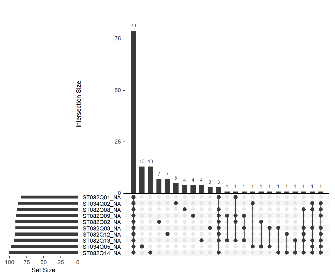
Figure 4: An UpSet plot showing missing data patterns among the PISA survey items
We can use Figure 4 to understand the number of missing responses per item. For example, if we look at the first row (ST082Q01), we can see that there are 83 missing responses based on the sum of the three frequencies marked for this item (i.e., 79 + 3 + 1). In addition, we can use the plot to identify missing response patterns. For example, the plot shows that 79 students skipped all of the survey items without selecting an answer (see the first vertical bar), while 13 students skipped either ST034Q05 or ST082Q14 (see the second and third vertical bars). Each column represents a different combination of items with missing responses (i.e., those with black marks). Overall, the UpSet plot can be quite useful for identifying problematic items in terms of missingness.
Stacked Bar Chart
The next visualization tool is the stacked bar chart. Stacked bar charts are not necessarily very exciting forms of data visualization but they are widely used in survey research to visualize Likert-type items (e.g., items with response options of strongly disagree, disagree, agree, and strongly agree). The likert package (Bryer & Speerschneider, 2016) offers a relatively straightforward way to create stacked bar charts for survey items. Without diving into all the options to customize these charts, I will demonstrate how to create a simple stacked bar chart using the first eight items focusing on teamwork. Since the likert package relies on the plyr package, we will have to activate both packages. The resulting plot shows the percentages of responses for each response option across the eight items.
# Activate likert and plyr
library("likert")
library("plyr")

# Select only the first 8 items in the survey
items <- select(data, starts_with(c("ST082")))

# Rename the items so that the question statement becomes the name
names(items) <- c(
  ST082Q01="I prefer working as part of a team to working alone.",
  ST082Q02="I am a good listener.",
  ST082Q03="I enjoy seeing my classmates be successful.",
  ST082Q08="I take into account what others are interested in.",
  ST082Q09="I find that teams make better decisions than individuals.",
  ST082Q12="I enjoy considering different perspectives.",
  ST082Q13="I find that teamwork raises my own efficiency.",
  ST082Q14="I enjoy cooperating with peers.")

# A custom function to recode numerical responses into ordered factors
likert_recode <- function(x) {
  y <- ifelse(is.na(x), NA,
              ifelse(x == 1, "Strongly disagree",
                     ifelse(x == 2, "Disagree",
                            ifelse(x == 3, "Agree", "Strongly agree"))))

  y <- factor(y, levels = c("Strongly disagree", "Disagree", "Agree", "Strongly agree"))

  return(y)
}

# Transform the items into factors and save the data set as a likert object
items_likert <- items %>%
  mutate_all(likert_recode) %>%
  likert()

# Create a stacked bar chart
plot(items_likert,
     # Group the items alphabetically
     group.order=names(items),
     # Plot the percentages for each response category
     plot.percents = TRUE,
     # Plot the total percentage for negative responses
     plot.percent.low = FALSE,
     # Plot the total percentage for positive responses
     plot.percent.high = FALSE,
     # Whether response categories should be centered
     # This is only helpful when there is a middle response
     # option such as "neutral" or "neither agree nor disagree"
     centered = FALSE,
     # Wrap label text for item labels
     wrap=30)
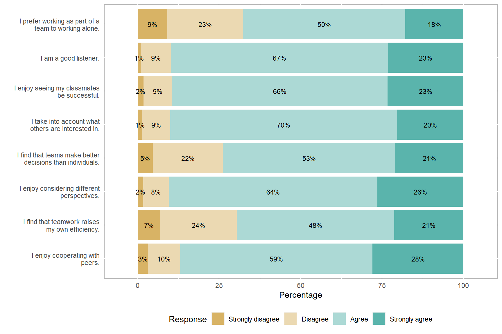
Figure 5: A stacked bar chart of the PISA survey items
Alluvial Plot
Alluvial plots (or diagrams) are similar to flow diagrams that represent changes over time or between different groups. Using an alluvial plot, we can demonstrate the flow of survey responses between different items or between different groups of respondents. You can check out the package vignette for more examples. In this example, we will use the ggalluvial package (Brunson, 2020). We will choose one of the survey items and create an alluvial plot using gender, immigration status, and responses given to the item. To transform the data from wide format to long format, we will use the reshape2 package (Wickham, 2007).
# Activate reshape2 and ggalluvial
library("reshape2")
library("ggalluvial")

# Transform the data from wide format to long format
data_long <- mutate(data,
                    # Create categorical gender and immigration variables
                    gender = ifelse(ST004D01T == 1, "Female", "Male"),
                    immigration = factor(
                      ifelse(is.na(IMMIG), NA,
                                         ifelse(IMMIG == 1, "Native",
                                                ifelse(IMMIG == 2, "Second-Generation",
                                                       "First-Generation"))),
                      levels = c("Native", "First-Generation", "Second-Generation")
                    )) %>%
  # Drop old variables
  select(-ST004D01T, -IMMIG) %>%
  # Make the variable names easier
  rename(grade = ST001D01T,
         student = CNTSTUID,
         age = AGE) %>%
  # Melt data to long format
  melt(data = .,
       id.vars = c("student", "grade", "age", "gender", "immigration"),
       variable.name = "question",
       value.name = "response") %>%
  mutate(
    # Recode numerical responses to character strings
    response2 = (ifelse(is.na(response), "Missing",
                        ifelse(response == 1, "Strongly disagree",
                               ifelse(response == 2, "Disagree",
                                      ifelse(response == 3, "Agree", "Strongly agree"))))),
    # Reorder factors
    response3 = factor(response2, levels = c("Missing", "Strongly disagree", "Disagree",
                                             "Agree", "Strongly agree"))

  )


# Create a frequency table for one of the items
ST082Q01 <- data_long %>%
  filter(question == "ST082Q01") %>%
  group_by(gender, immigration, response3) %>%
  summarise(Freq = n())

# Create an alluvial plot
ggplot(ST082Q01,
       aes(y = Freq, axis1 = gender, axis2 = immigration, axis3 = response3)) +
  geom_alluvium(aes(fill = gender), width = 1/12) +
  geom_stratum(width = 1/12, fill = "black", color = "grey") +
  geom_label(stat = "stratum", aes(label = after_stat(stratum))) +
  scale_x_discrete(limits = c("gender", "immigration", "response3"), expand = c(.1, .1)) +
  scale_fill_brewer(type = "qual", palette = "Set1") +
  ggtitle("I prefer working as part of a team to working alone.")
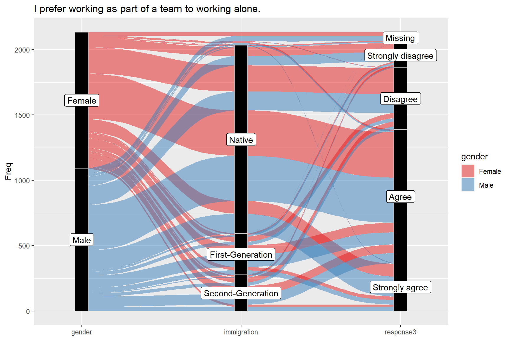
Figure 6: Alluvial plot of the item ST082Q01, gender, and immigration status
Item-Person Map
The last data visualization tool that we will review is called the item-person map (also known as the Wright map). The Partial Credit Model (PCM), which is an extension of the Rasch model for polytomous item responses, can be used for survey development and validation (Green & Frantom, 2002). We can analyze survey items using PCM and obtain item thresholds for each item. These thresholds indicate the magnitude of the latent trait required to select a particular response option (e.g., selecting disagree over strongly disagree). Using an item-person map, we can see thresholds for the items as well as the distribution of the latent trait for the respondents. This plot is quite useful for analyzing the alignment (or match) between the items and respondents answering the items.
PCM can be estimated using a variety of R packages, such as mirt (Chalmers, 2012) and eRm (Mair et al., 2020). In the Handbook of Educational Measurement and Psychometrics Using R, we provide a step-by-step demonstration of how to estimate PCM using the mirt package. To create an item-person map, users can use the plotPImap function in the eRm package. Since I typically use the mirt package instead of eRm, I wrote my own function to create an item-person map using PCM results returned from the mirt package. My itempersonmap function is available here.
After downloading the R codes for the itempersonmap function, we can use the source function to import it into R. First, we will select the eight items focusing on teamwork (remember that the other two items did not seem to work well with the rest of the items and thus they are excluded here). Next, we will recode the responses from 1-2-3-4 to 0-1-2-34. Finally, we will estimate the item parameters using PCM. In the mirt function, itemtype = "Rasch" applies the Rasch model to binary items and PCM to polytomous items. Since our survey responses are polytomous, PCM will be selected for estimating the item thresholds. Note that we add technical = list(removeEmptyRows=TRUE) because there are 79 respondents who skipped all of the items on the survey. Therefore, we have to remove them before estimating the model.
We are saving the results of the model estimation as “mod.” If the model converges properly, all the information that we need to create an item-person map will be saved in this mirt object. After the estimation is complete, we can simply use itempersonmap(mod) to create an item-person map. In the plot, red points indicate item thresholds for each item (three thresholds separating four response categories) and the asterisk indicates the average value of the thresholds for each item. The higher these thresholds, the more “teamwork” is necessary. On the left-hand side of the plot, we also see the distribution of the latent trait (i.e., the construct of teamwork).
source("itempersonmap.R")

# Save the items as a separate dataset
items <- select(data, starts_with(c("ST082"))) %>%
  # Change responses from 1-2-3-4 to 0-1-2-3 by subtracting 1
  apply(., 2, function(x) x-1)

# Activate the mirt package
library("mirt")

# Estimate the Partial Credit Model
mod <- mirt(items, 1, itemtype = "Rasch",
            technical = list(removeEmptyRows=TRUE),
            verbose = FALSE)


# Create the item-person map
itempersonmap(mod)
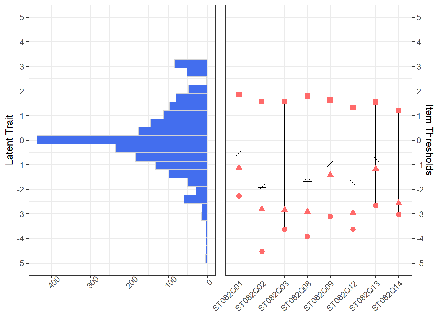
Figure 7: An item-person map of the PISA survey items
Conclusion
In this post, I wanted to demonstrate five alternative ways to visualize survey data effectively. Some of the visualizations (e.g., stacked bar chart and alluvial plot) can be used for presenting the survey results, while the other plots (e.g., UpSet plot and correlation matrix plot) can be used for identifying problematic items in the survey. The item-person map is also a very effective tool that can be used for evaluating the overall quality of the survey (i.e., the alignment between items and respondents) and determining whether more items are necessary to measure the latent trait precisely.
The other training materials are available at https://github.com/okanbulut/dataviz.↩︎
See Johannes Kepler University’s Visual Data Science Lab for further information.↩︎
Check out the package’s GitHub page: https://github.com/njtierney/naniar↩︎
This is what the
mirtfunction requires.↩︎